New colors for our products
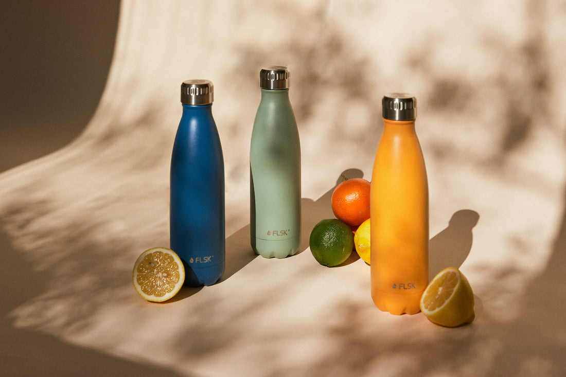
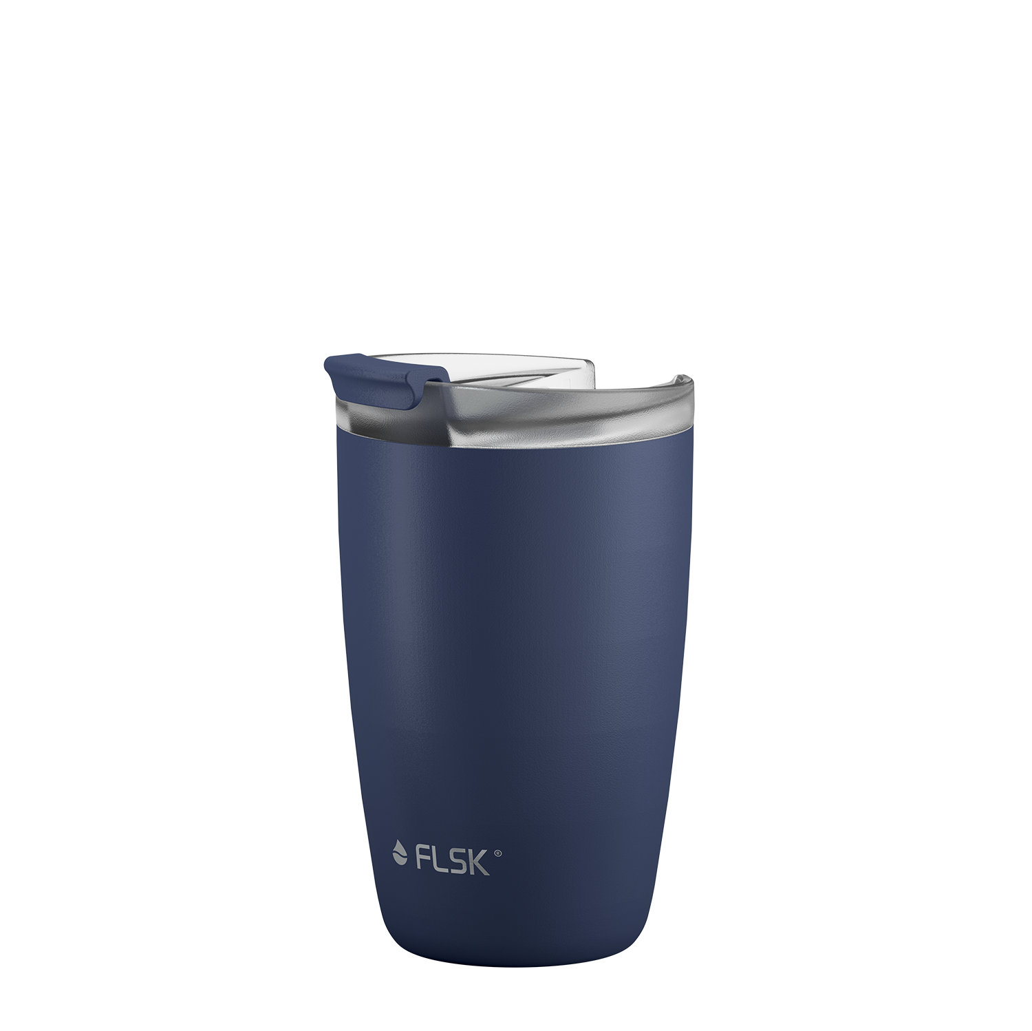
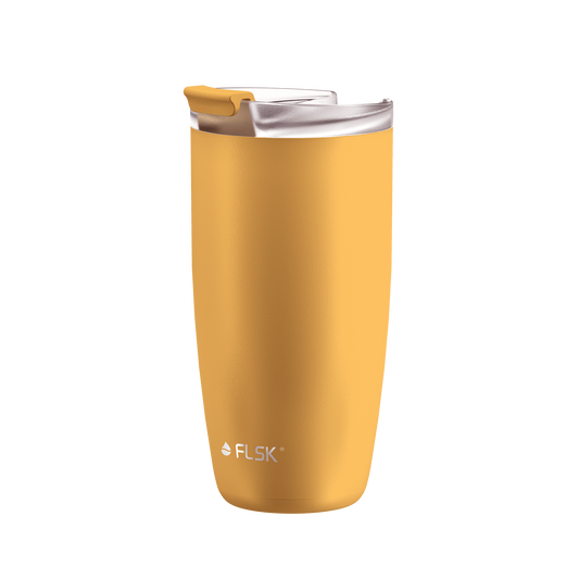
Have you already discovered our Spring Collection with its vibrant, bright shades of ocean, sage and sunrise? Three shades that awaken a longing for warmth and vacation, fit perfectly into your life and are simply stunningly beautiful.
But how do our FLSK products actually get their new colors? Today we give you an insight into the work of our product designers. Be curious!
Color development requires a keen sense of trends
When you buy a FLSK product, you are always right in terms of color. Every color reflects your excellent taste, shows your sense of zeitgeist and makes a new facet of you shine. How can that be? It's not so much magic as hard work.
Our marketing team conducts intensive market observation and trend research to offer you the finest selection of possible shades. They constantly keep their eyes open and their feelers out - in our own sector, but also in other sectors such as interiors or automobiles. What is happening on the market and in the world? What's coming, what's going? What are influencers posting? This gives the color team a rough idea of the new shade.
The color says – modern freshness
For the sage color, the elegant mint green, the team was inspired by the major trend towards naturalness: The pastel color nuances look fresh in interior design as wall paint or bed linen and create a sensual, relaxed atmosphere - without any kitsch.
Mint green is also known for combining well with other shades and always looking different. Try it out: Against marble and black aluminum, your FLSK favorite in sage looks chic and grown-up. Next to wood and rattan, it looks cheerful and light. By the way: the gender-neutral mint green is not traditionally assigned to any particular gender.

The color sunrise – southern joie de vivre
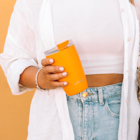
Sometimes customer feedback or requests as well as our own experiences in the color process also help. We received many requests from customers like you for drinking bottles and coffee to go cups in cheerful colors. It became clear to us: we wanted a color that captures the warmth. Because just like the sunrise that gives it its name, sunrise always brings a positive twist to your day and a smile to your face. This has a positive and cheerful effect without being obtrusive, loud or shrill.

The color ocean – a sea of abundance
An intense blue completes the Spring Collection - just like the sea looks on a surprisingly warm, clear day in May on the Cote d'Azure. The wind carries in salty air and whispers stories of carefree days, swaying waves and sand between your toes. This makes the shade perfect for anyone who likes to dream and prefers stronger, brighter colors. Our ocean blue complements our previously muted color portfolio perfectly.
The color ocean blue is used in many different areas of interior design. It is used to create a relaxing, cheerful atmosphere and at the same time convey a feeling of freshness and openness. In modern homes, strong blue is often used as an accent color, for example in the form of cushions, curtains, carpets or works of art. Such accents can add a touch of color and vibrancy to an otherwise neutral space.

The power of color
When narrowing down the color selection, the color team then goes into the discussion at least as meticulously, because: Colors work. They have a greater power over us than we would like - and also than we realize. That's why we have very high and varied requirements for a new FLSK color. So before we accept a color, it goes through a demanding "assessment center".
- Does the color fill a gap in our existing color palette?
- Does the color look good on the shape of our products?
- Can we give you a feeling with the color that makes your life more beautiful?
The decision is made: Which color can be used on our products?
If suitable colors are shortlisted, the color team samples similar shades. You're looking at at least five slightly different shades of each color on the products - slightly lighter, slightly darker, slightly redder, slightly more pastel, etc.
Once you have found the perfect color, distribute the samples to our team. Everyone is given the task of gathering feedback from friends and customers and then filling out a survey.
In it we ask: “Would you buy this color privately?” and “Do you think we should include this color?” Are the results like sunrise, sage and ocean? Yes! Yes! Yes!, the color is accepted. Production is now underway and everyone is looking forward to the new arrivals like crazy.
Discover our new Spring Collection now!
- Engraveable.
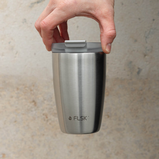
FLSK coffee cup
500 ml · stainless - all natural
- Engraveable.
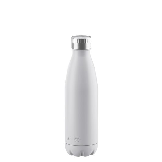
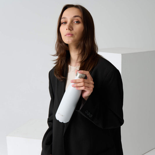
FLSK drinking bottle
500 ml · white
- Engraveable.
